The Width of Lowercase ´m´
Strong opinions
Our clients often question the width of the lowercase 'm' in TORA signage, sparking a debate due to the lack of clear specification in ICAO or EASA regulations. They express varied opinions, with some advocating for a narrower width in line with traditional typographic norms, saying something along the line “lowercase characters are never wider than their uppercase counterpart”.
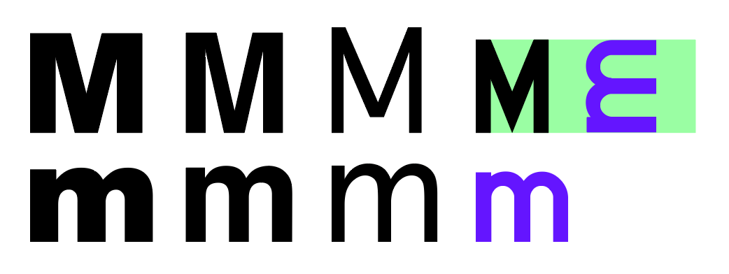
This is generally true for all letters, except 'm' and 'w'. If you check you will find that many common fonts have lowercase letter 'm' that is wider than uppercase 'M', especially bolder variants where the three legs need to be adequately spaced in order to be legible. See examples above from left to right: Arial black, Helvetica, Geneva and Highway Gothic.
Highway Gothic
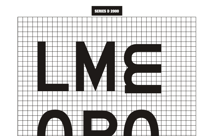
If you work in the guidance sign industry you may recognise the rightmost font, as this is a modern variant of the FHWA Series D adapted by all of the civil aviation regulations.
• Wikipedia: Highway Gothic
• FHWA: Standard Alphabets for Traffic Control Devices
ICAO
So what do the regulatory documents actually say about it? In Annex 14, Vol 1, page APP 4-12, Instructions point 5:
For the intersection take-off sign, the height of the lower case “m” is 0.75 of the height of the preceding “0” (zero) and spaced from the preceding “0” at code 1 for the character height of the numerals.
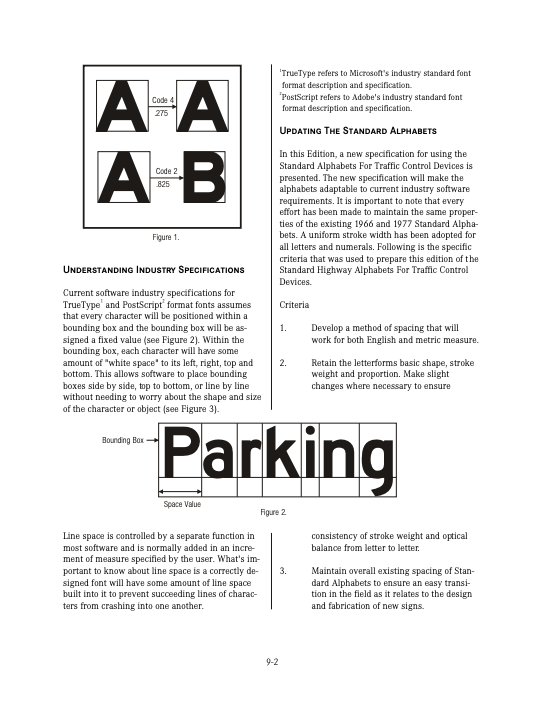
As you can see, it says nothing about the width. What else is there? In Figure 5-31 on page 5-85 we find the following examples:
If you compare the glyphs and spacing with below sign, a compliant message drawn using Wingframe, you can see that the examples are “rough”, with inaccurate spacing. Clearly they are not meant to be used as reference for precision drawings.
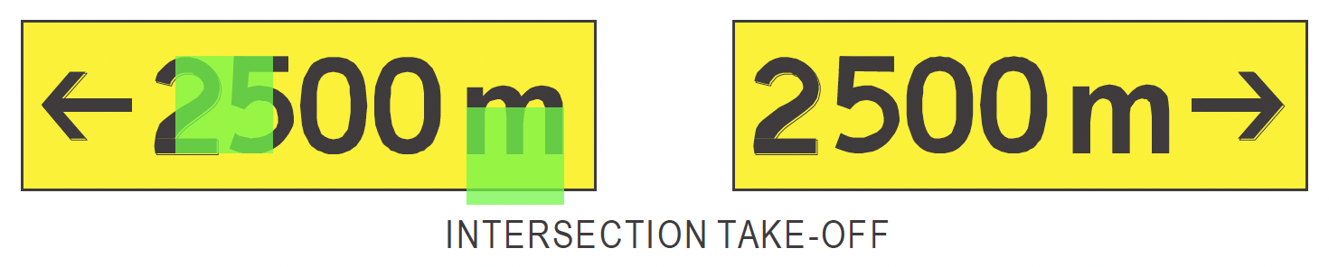
However, as you can see I have overlapped two green squares in the ICAO examples, simply to illustrate that the legend height of a numeral appears to equal the width of the lowercase 'm'. This is a hint of what the width could be. Can we find anything to corroborate this?
FHWA Series D
Below is the FHWA Series D glyphs extracted and placed next to each other, and as you can see (despite the small shift in the grid squares) the height of uppercase 'M' matches the width of the lowercase 'm'. So we now have two sources suggesting that, for a TORA message with legend height 300mm, the width of lowercase 'm' should also be 300mm.
Also note that, in the grid you can count the height of 'm' to be roughly 7.5 grid squares, giving a reference for the 0.75 value specified by ICAO.
Let's use width 300mm 264mm
The problem is, guidance signs are not cheap equipment. All manufacturers use a couple of standard sizes, instead of building custom sized boxes/cabinets for each specific message. This means that, if you could use a lowercase 'm' that is more narrow, they can potentially select a smaller box size and quote their clients a lower price. So this is historically what has happened.
264mm is not our choice of width. It stems from an old glyph set that was used by one of the major manufacturers in the industry. Where they found it is unclear. In any case, the choice is arbitrary as ICAO does not include it in the specification.
If I had to guess, the width is just the sum of the glyph stroke widths 48mm × 3 legs, plus the leg space, in this case 2 × 48mm × 125%. (3 × 48 + 2 × 60 = 264)
The problem is further complicated by the fact that AENA – the Spanish Civil Aviation Authority – specifies a lowercase 'm' that is 0.5 of the legend height, not 0.75 as ICAO, EASA, etc. So Wingframe will soon support the ability for message designers to select which variant they prefer, or perhaps even set an exact width within a range.
What do you think?
If you have any further questions regarding this, or have some other argument for what the width of lowercase 'm' should be, please contact info@wingframe.com. We would love to hear it.