Takeoff Run Available (TORA), a proposal
Introduction to TORA in airports
When you're at an airport, you might notice various signs and markings along the runways. Among these, one critical yet often overlooked aspect is the "Takeoff Run Available" or TORA. Understanding TORA is essential for pilots and plays a significant role in ensuring safe flight operations.What is TORA?
TORA refers to the length of the runway that is declared available and suitable for the ground run of an airplane during takeoff. This measurement is vital for pilots to determine if there's enough runway length for the aircraft to accelerate to the necessary speed and safely lift off.
Why is TORA important?
TORA is not just a number; it's a key safety feature. Pilots use this information, along with the aircraft's performance data and environmental factors (such as wind, temperature, and aircraft weight), to calculate the feasibility of a safe takeoff. If the TORA is insufficient, pilots might need to make adjustments, like reducing the plane's weight or even choosing not to take off until conditions improve.
The role of TORA signs
Airports use TORA signs to inform pilots about the available runway length from specific points. These signs are crucial, especially in situations where the entire length of the runway is not usable due to factors like maintenance, obstructions, or other operational considerations.
Addressing the design and installation inconsistencies of TORA signs
While TORA signs are crucial for aviation safety, there are notable concerns regarding their design and installation. These issues can potentially lead to confusion and operational inefficiencies. Let’s delve into these challenges.Inconsistency with other airfield signs
TORA signs, which indicate the available runway length from a certain point, don't align well with the more standard directional or destination signs seen in airfields. Unlike the latter, which guide pilots along taxiways or to specific locations, TORA signs provide specific information about the remaining distance of the runway. This unique function might not be immediately apparent due to the lack of a distinctive design, potentially causing confusion.
Runway Distance Remaining signs
TORA and RDR signs share a similar overarching purpose: providing critical distance information related to the runway. However, their visual presentations are markedly distinct. Given the typically straightforward and unambiguous nature of airfield guidance signage, the presence of two different sign types for seemingly similar information introduces an element of inconsistency.
Installation variability
The effectiveness of TORA signs is further compromised by inconsistencies in their installation. This includes variations in the size of the sign's text, inconsistent positioning, and sometimes, a combination of different types of messages (such as location, mandatory, and information) in a single sign array. Such practices contravene regulations that recommend separating information and mandatory message types to prevent misinterpretation.
Legend variability
The legends on TORA signs can also vary, sometimes excluding units (m) or being combined with destination messages. This inconsistency can be problematic, as precise understanding of distances is crucial for pilots calculating takeoff performance.
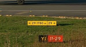
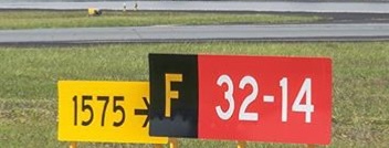
Some examples
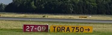
It wasn't hard to find below examples. The pictures are from Instagram posts of airplanes on runways, so one would expect a representable sample of TORA signs. So unfortunately – beyond the black legend on yellow background – I believe there is little consistency regarding design, legend and positioning.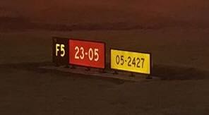
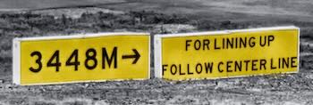
I assume this is a TORA, but it's hard to know as there is no unit or arrow. It's also combined with a runway designator, perhaps for clarity? Positioning is in line with the hold position, almost close enough to be a single sign array.
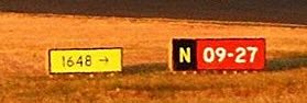
Another confusing combination where the message has ambiguous meaning. Positioned behind the hold position.
A non-illuminated version, missing the unit and with an arrow pointing towards the location message.
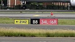
Another sign missing the unit, with an arrow pointing towards the location message.
Another one too close to the holding position, missing the unit.
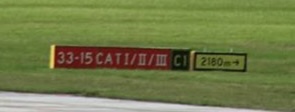
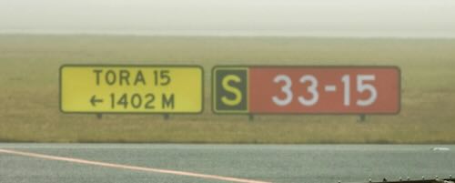
Appears to be a single sign array, and the lowercase 'm' is the AENA 0.5 version, despite not being in spain (according to the image description).
Another one in a single sign array with legend height 400mm.
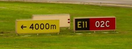
One using uppercase 'M' as unit for meters.
A less standard one, double lined with text “TORA 15”, and uppercase 'M' as unit for meters.
A version with legend height 400mm. The allowed message types combination rule results in this extra spacing between the signs, as if this solves the problem.
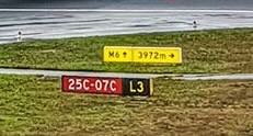
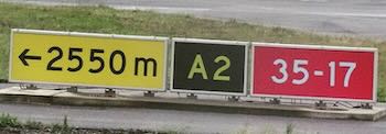
Another destination message combined with a TORA.

... And one more. Also using the AENA 'm' despite not being in Spain.
Here we have one in combination with a mandatory message, including the text “TORA”, but missing the unit.
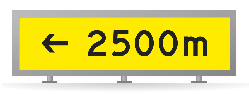
A new TORA design proposal
Recognizing the inconsistencies and potential confusion arising from the current designs of TORA signs, there's a clear need for a redesigned approach. A revised design should strive to harmonize TORA and RDR signs, encapsulating their joint objective of providing runway distance information, while also prioritizing clarity and ease of understanding. This approach would not only improve the overall coherence of airfield guidance signage but also enhance its effectiveness.
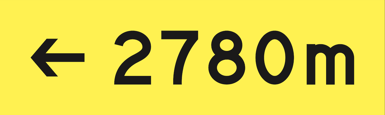
Draft of the new design proposal (WIP)
The current design
Reasoning behind the new proposal
The proposed redesign of TORA signs integrates several key elements to enhance clarity, consistency, and ease of understanding. Here's a breakdown of the choices made in this new design:
-
Consistent Color Scheme with RDR Signs: Adopting the same color scheme as Runway Distance Remaining signs – white legend on a black background – creates a visual consistency across runway-related signage. This uniformity aids in immediate recognition and interpretation.
-
Runway Start Representation: The left side of the design features the familiar runway marking lines, akin to those seen at the start of runways. This symbolic representation immediately conveys to pilots that the distance indicated on the sign is measured from their current position to the end of the runway.
-
Distinctive Distance Arrow with Fixed Orientation: The design includes a small triangle, similar to the head of a measurement arrow, placed between the runway lines and the distance figure. This specific arrow style is chosen to differentiate it from the directional arrows common in airfield signage. Crucially, unlike directional arrows, this distance arrow will always maintain a fixed horizontal orientation, pointing either left or right. It will never be displayed in a rotated form, such as pointing upwards or diagonally, to avoid any confusion with directional guidance. This ensures that the arrow's purpose - indicating a linear distance along the runway - is immediately clear and unambiguous.
-
Standardized Size: Keeping the size of the new TORA signs identical to the current ones simplifies the replacement process. This consideration is practical for airports, minimizing disruption and the need for structural modifications.
-
Runway-Like Appearance: The combination of the white runway lines on a black background creates an overall appearance reminiscent of a runway. This intuitive design, coupled with the simple arrow and distance text, effectively communicates that the sign represents the length of the runway ahead.
Sign positioning
The implementation of the new TORA design brings significant improvements in terms of sign positioning, particularly in relation to hold positions and the integration with other airfield signs. This redesign addresses previous concerns and contradictions in message conveyance. Here's how the new design influences sign positioning:
-
Compatibility with Hold Positions: The revised TORA design, featuring a simple distance arrow without suggesting directional movement, eliminates the previous contradiction with hold position signs. Traditional yellow information signs with directional arrows could inadvertently conflict with the mandatory red "HOLD HERE" message, potentially causing confusion. The new TORA design, devoid of such directional implications, can coexist harmoniously with hold position signs, clearly communicating that the aircraft should await permission to proceed, and not “continue in some direction”.
-
Integration with Destination or Direction Messages: Given the distinctive and focused design of the new TORA signs, combining them with destination or direction messages is no longer problematic. The redesigned TORA sign, with its clear and specific purpose, stands out as a separate and easily interpretable piece of information. This eliminates the concerns of mixed messaging that could arise with the previous design, ensuring that each sign’s intent is immediately clear to pilots.
-
Placement Relative to Location Messages: To further reduce ambiguity, it's preferable to position the new TORA signs on the opposite side of any location messages. This placement strategy helps in clearly demarcating the location information from the TORA information, ensuring that pilots can easily distinguish and understand both types of guidance without confusion.
In summary, the new TORA design not only enhances clarity in terms of the information provided but also offers greater flexibility and safety in its positioning in relation to other airfield signage.
Overall, this redesign aims to resolve existing ambiguities and enhance the functionality of TORA signage, contributing to safer and more efficient airfield operations.
What do you think?
Are you an industry professional and care about the design of airfield signage? We would love to get your feedback on this proposal. Please contact info@wingframe.com.